The dining room is more than just a place to eat—it’s where stories are shared, connections are deepened, and celebrations unfold. The color of your dining room walls plays a powerful role in setting the mood for these moments. Whether you’re drawn to bold, dramatic tones or soothing neutrals, choosing the right paint color can elevate your space and reflect your personality.
In this comprehensive guide, we explore 42 stunning dining room paint colors tailored for every aesthetic and atmosphere—ranging from modern minimalism to rustic warmth and vibrant playfulness. These ideas are designed to inspire and guide you, whether you’re updating a small dining nook or redesigning a grand formal dining hall.
🎨 Why Paint Color Matters in the Dining Room

Before we dive into the shades, let’s explore why paint color deserves your attention:
- Influences Mood: Soft colors relax the mind; bold colors energize the space.
- Defines Functionality: Sets the tone—casual, elegant, or festive.
- Shapes Space: Light hues open up rooms; darker tones add depth and coziness.
- Complements Decor: Acts as the canvas for furniture, lighting, and art.
Now, let’s get to the good part—the color inspiration!
🌿 1–8: Warm and Inviting Neutrals
1. Warm Beige
A timeless go-to, warm beige creates a cozy, approachable feel. This hue is perfect for traditional or transitional dining rooms and pairs well with wood accents and earth-toned decor.
2. Classic White
Simple yet powerful, white walls reflect natural light and create a crisp, clean backdrop. Pair it with vibrant artwork, colorful centerpieces, or metallic chandeliers for visual interest.
3. Soft Gray
Soft gray adds understated elegance to the room. It’s neutral without being bland and works equally well with modern minimalism and rustic farmhouse styles.
4. Pale Buttercream
A creamy off-white with a yellow undertone, buttercream evokes warmth and light, ideal for casual breakfasts and family dinners alike.
5. Warm Taupe
Subtly grounded and earthy, taupe is a calming alternative to gray. It balances beautifully with both warm wood and cool metallics.
6. Misty Gray
Cooler than soft gray but just as versatile, misty gray sets a tranquil tone and serves as a perfect backdrop for pops of color in art or upholstery.
7. Light Peach
Peach tones bring in natural warmth and softness. Light peach can subtly brighten a room without overwhelming the senses.
8. Rosy Beige
Rosy undertones in beige create a romantic and feminine atmosphere that pairs wonderfully with rose gold accents and soft lighting.
🌊 9–16: Serene Blues and Calming Greens
9. Slate Blue
A muted blue-gray, slate blue offers a refined and contemporary look. It pairs effortlessly with light wood and brushed nickel fixtures.
10. Ocean Blue

Ocean blue evokes a coastal, relaxing vibe. Perfect for beach-themed homes or rooms with large windows, it brings the calmness of water indoors.
11. Cool Mint
Cool mint is fresh and energizing—a great choice for small dining areas that need visual expansion and a breath of fresh air.
12. Seafoam Green
Seafoam sits between blue and green and promotes relaxation. It works beautifully with white trim and natural woven textures.
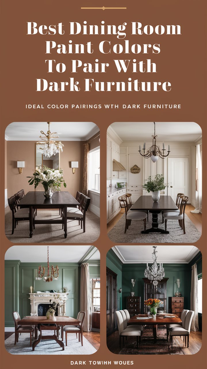
13. Earthy Green
Earthy greens—think olive, moss, or sage—are excellent for grounding the dining space and inviting nature indoors.
14. Olive Green
This versatile tone complements wood finishes and brass lighting fixtures, adding a cozy and traditional touch.
15. Calm Teal

Teal adds a sophisticated splash without going overboard. It’s elegant, trendy, and serene all at once.
16. Sapphire Blue
Rich and luxurious, sapphire blue creates a deep, regal feel perfect for formal dinners and glamorous accents.
🔥 17–24: Warm Earth Tones for a Cozy Feel
17. Burnt Orange
A bold choice that brings vibrancy and warmth, burnt orange pairs well with rustic wooden tables and vintage pendant lighting.
18. Terracotta
Reminiscent of Mediterranean charm, terracotta introduces a sunbaked, earthy elegance. It works wonderfully with stone and textured materials.
19. Muted Clay
Muted clay is a perfect blend of brown and red, bringing coziness without overwhelming the senses.
20. Mocha Brown

Rich mocha adds depth and sophistication. Ideal for spaces with light furniture or minimalist decor.
21. Burgundy Red
This timeless, deep red is excellent for creating an intimate and inviting ambiance, especially when paired with candlelight and gold accents.
22. Warm Cinnamon
Cinnamon has a spicy warmth that feels festive yet natural. It’s great for seasonal decor rotations and cozy vibes year-round.
23. Golden Yellow
Bright, energetic, and cheerful—golden yellow works well in sunlit rooms and with neutral-toned furniture.
24. Rust Red
Rust tones add an organic, grounded feeling and pair beautifully with vintage or boho-inspired settings.
💎 25–32: Rich Jewel Tones for Drama and Elegance
25. Emerald Green
A showstopper, emerald green makes a bold statement. Paired with brass and velvet, it oozes sophistication.
26. Deep Plum
Deep plum introduces a royal feel, perfect for creating an upscale dining experience. Works best with dark wood and layered lighting.
27. Aubergine
This deep, eggplant-inspired shade adds drama and elegance, especially in candlelit spaces.
28. Navy Blue
Navy remains one of the most beloved dramatic tones. It adds structure and pairs well with crisp whites and warm metals.
29. Rich Maroon
Maroon adds richness and gravitas to a dining space. Think old-world elegance with a modern twist.
30. Vibrant Turquoise
Energetic and cheerful, vibrant turquoise is a fun choice for eclectic or global-inspired interiors.
31. Charcoal Gray
Sleek and modern, charcoal gray serves as a versatile anchor for bold furniture or gallery walls.
32. Smoky Black

For the bold at heart, smoky black walls are ultra-modern and sophisticated. Just be sure to balance it with ample lighting.
💡 33–40: Playful Pastels and Unique Picks
33. Blush Pink
Soft and romantic, blush pink adds warmth and femininity. It pairs beautifully with copper, rose gold, or marble accents.
34. Soft Coral
Lively yet approachable, soft coral makes meals feel joyful and intimate. Works great in eclectic or coastal spaces.
35. Powder Blue
Delicate and dreamy, powder blue sets a tranquil tone. Especially beautiful with vintage accents and natural textures.
36. Lush Lime
Zesty and cheerful, lime green breathes life into the room. Best used with minimal furniture to let the color shine.
37. Crisp Aqua
Crisp aqua is fresh and invigorating, perfect for energizing morning meals. It blends well with white and silver.
38. Coral Pink
Vibrant without being overpowering, coral pink adds charm and charisma to any dining space.
39. Light Lavender
Lavender feels delicate and calming. It enhances natural light and gives a soft, dreamy vibe to your mealtimes.
40. Pale Buttercream
Rounding off with this gentle, golden-white tone—pale buttercream is warm, classic, and universally flattering.
41. Dusty Rose
Dusty rose is a muted pink with soft brown undertones, bringing a vintage yet sophisticated vibe to your dining space. This color works wonderfully in both classic and contemporary interiors, offering a balance between femininity and maturity. Pair it with matte gold fixtures, velvet dining chairs, or cream-colored trims for an effortlessly elegant setup. It’s a perfect pick for those who want a romantic feel without going overly bright or bold.
42. Stormy Blue
Stormy blue sits between gray and navy, exuding a moody yet calming energy. It’s perfect for those looking to create a cozy, introspective dining experience. Ideal for rooms with plenty of natural light, this shade adds depth without making the space feel closed in. Use it alongside brushed nickel lighting, soft linen curtains, and minimalist wooden furniture to complete a stylish and serene atmosphere.
🖼️ Tips for Choosing the Perfect Paint Color
- Test Samples First: Lighting drastically affects how colors appear. Try swatches on all four walls and observe them throughout the day.
- Consider Natural Light: Rooms with little sunlight may benefit from lighter or warmer tones to avoid feeling gloomy.
- Complement Furniture and Decor: Always account for your table, chairs, flooring, and art when choosing colors.
- Balance with Trim and Ceiling: Don’t forget to coordinate trim and ceiling colors for a cohesive look.
- Don’t Fear Bold Hues: If you love vibrant colors, embrace them. Dining rooms are often used during evenings—perfect for rich, moody tones.
💬 Conclusion: Let Color Tell Your Story
Choosing the right paint color for your dining room isn’t just about style—it’s about creating an experience. Whether you want to foster connection, inspire conversation, or impress guests, your walls can help set the scene. From earthy neutrals to vibrant jewel tones and soft pastels, this guide offers inspiration for every mood, style, and home.
Remember: There are no wrong colors—only the ones that don’t reflect your personality. Let your dining space speak volumes with the hue that resonates most with you.